

CASE STUDY

Living by Design Ketonutrition

Designed a membership-based wellness platform that builds trust and simplifies learning. Living By Design Ketonutrition needed more than a website. They needed a platform that could educate, convert visitors into members, and provide a seamless experience for clients purchasing courses and resources.

calendar-days-regular-full

Timeline

4 Months

Platform

WordPress

Role

Designer & Developer

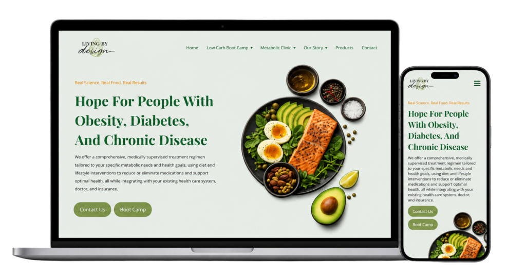
Living by Design Image of Site on Laptop and Mobile

Project Overview

The website was designed to help visitors understand the client’s nutrition philosophy, explore available resources, purchase educational content, and become members of the community.
Because the business focuses on health and lifestyle transformation, the experience needed to feel welcoming, trustworthy, and easy to navigate without overwhelming new visitors.
The goal was to create a modern, approachable website that reflected their mission while laying the foundation for future growth.

The Challenge

Before the design, the client faced several challenges:

Information wasn’t organized in a way that guided visitors naturally.
Educational resources needed a clearer structure.
The website needed to support future online courses and memberships.
Visitors needed stronger calls-to-action throughout the site.
The overall design needed to better communicate professionalism while remaining personal and approachable.

Goals

Together, we identified several goals for the project.

Create a modern, trustworthy brand presence

Organize information into an intuitive navigation structure

Improve the customer journey from visitor to member

Build a scalable foundation for future courses and membership content

Ensure the website performs well across desktop, tablet, and mobile devices

My Process For Living by Design

1. Discovery

Every project starts with understanding the business. During discovery, we discussed: business goals, target audience, existing pain points, future expansion plans, and desired visual style. This allowed the website strategy to support not only today’s needs but future growth as well.

2. Content Planning

Instead of designing first, we organized the content. What the client desired was simplified navigation, page hierarchy, organized educational content, clear calls-to-action, and structuring the membership experience. Good structure makes every design decision easier.

3. Design

The visual design focused on creating confidence. Key priorities included: Clean layouts, consistent typography, a soft, welcoming color palette, clear visual hierarchy, and mobile-first responsiveness. Every section was designed to answer a visitor’s next question and encourage them to continue exploring.

4. Development

The website was built using WordPress with flexibility in mind. This ensured that layouts are responsive, custom, performance-optimized, SEO friendly, and an easy-to-use membership course.

5. Launch

Thorough testing across devices, final optimization, and a smooth launch set the foundation for continued growth.

Explore The Project

Interact with the website below to see the design, navigation, and user experience in action.

livingbydesignketonutrition.com

Key Features

Membership Ready
The website was built to support a growing membership program that provides users with access to exclusive educational content.
Course Integration
Educational resources and future online courses were planned into the website architecture from the beginning.
Conversion Focus Design
Strategic call to action guide for visitors to learn more, join, and purchase
Mobile Responsiveness
The experience was carefully designed to work seamlessly across phones, tablets, and desktop computers.
Easy Content Management
The client can easily update pages, resources, and educational content without needing a developer.

Results

The completed website provides lasting value for both the business and its community.

Professional online presence that reflects the client’s expertise and mission

Streamlined user experience that makes information easy to understand

Clear pathway that converts visitors into members and paying customers

Scalable foundation for future courses, resources, and membership growth

Better organization of educational content and a strong brand identity

Technology Used

WordPress
Astra Theme
HTML
CSS
PHP
JavaScript
MemberPress
Stripe Integration

What I Enjoyed The Most

One of the most rewarding parts of this project was balancing education with simplicity. Health and nutrition websites often contain a large amount of information, so every design decision focused on making that information feel approachable rather than overwhelming.
Designing the membership experience also required thinking beyond today’s needs, creating a flexible foundation that can grow as new courses, resources, and member features are added.

Cross the Bridge

Whether you’re launching a new business, refreshing your online presence, or ready to invest in a website that works harder for your business, I’d love to help. Together, we’ll create a website that not only looks professional but builds trust, strengthens your brand, and helps bridge the gap between your business and your customers.

Scroll to Top